Terminal Hero
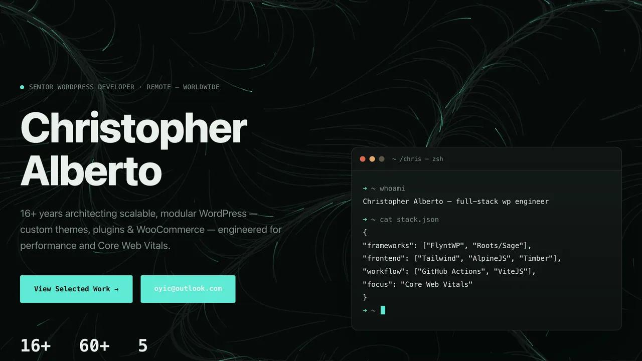
BlockHero
Two-column hero with a status line, headline, stats and an animated terminal that types out commands.
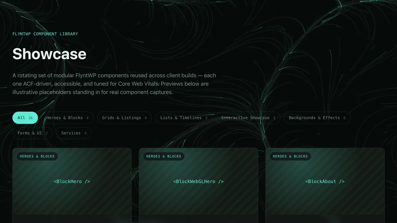
A rotating set of modular FlyntWP components reused across client builds — each one ACF-driven, accessible, and tuned for Core Web Vitals.
 Heroes & Blocks
 BlockHero
Two-column hero with a status line, headline, stats and an animated terminal that types out commands.
 Heroes & Blocks
 BlockWebGLHero
Full-bleed hero with a chromatic RGB-wave WebGL shader, glass CTA and optional availability badge.
 Heroes & Blocks
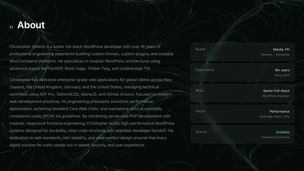
 BlockAbout
Bio with a numbered heading and a list of info rows (label, value, detail) with an accent option.
 Heroes & Blocks
 BlockMarquee
An endlessly scrolling text band for skills, clients or slogans.
 Grids & Listings
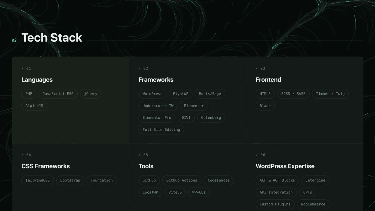
 GridTechStack
Joined three-column panel of skill categories with tag chips and an optional full-width highlight row.
 Grids & Listings
 GridWorkProjects
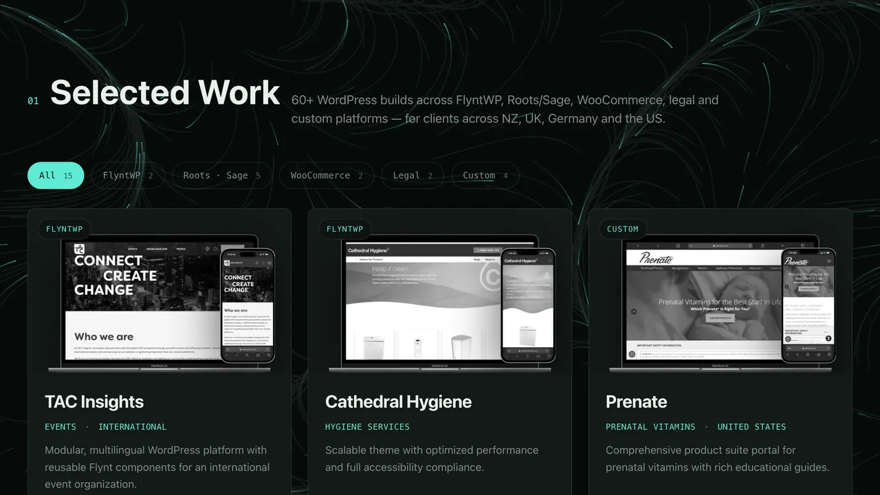
Filterable portfolio grid with laptop + phone mockups, industry, location and "What I built" details.
 Grids & Listings
 GridApplicationShowcase
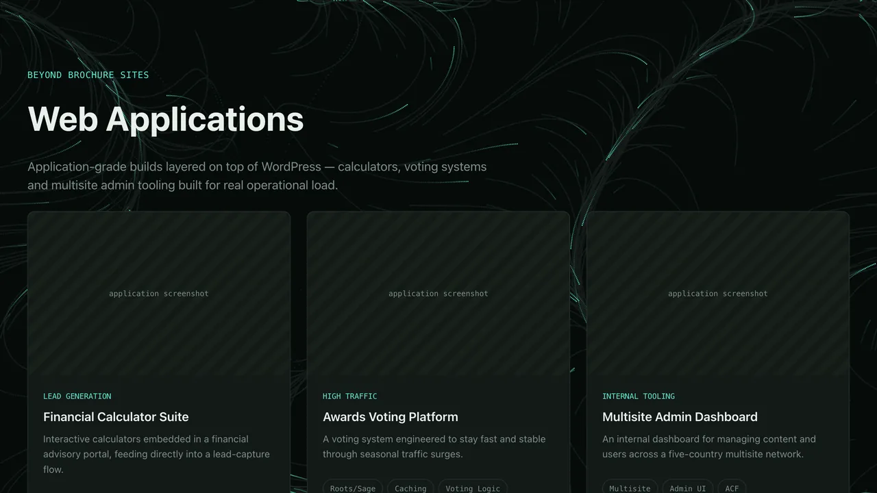
Grid of applications built, each with category, description and tech tags.
 Grids & Listings
 GridPluginShowcase
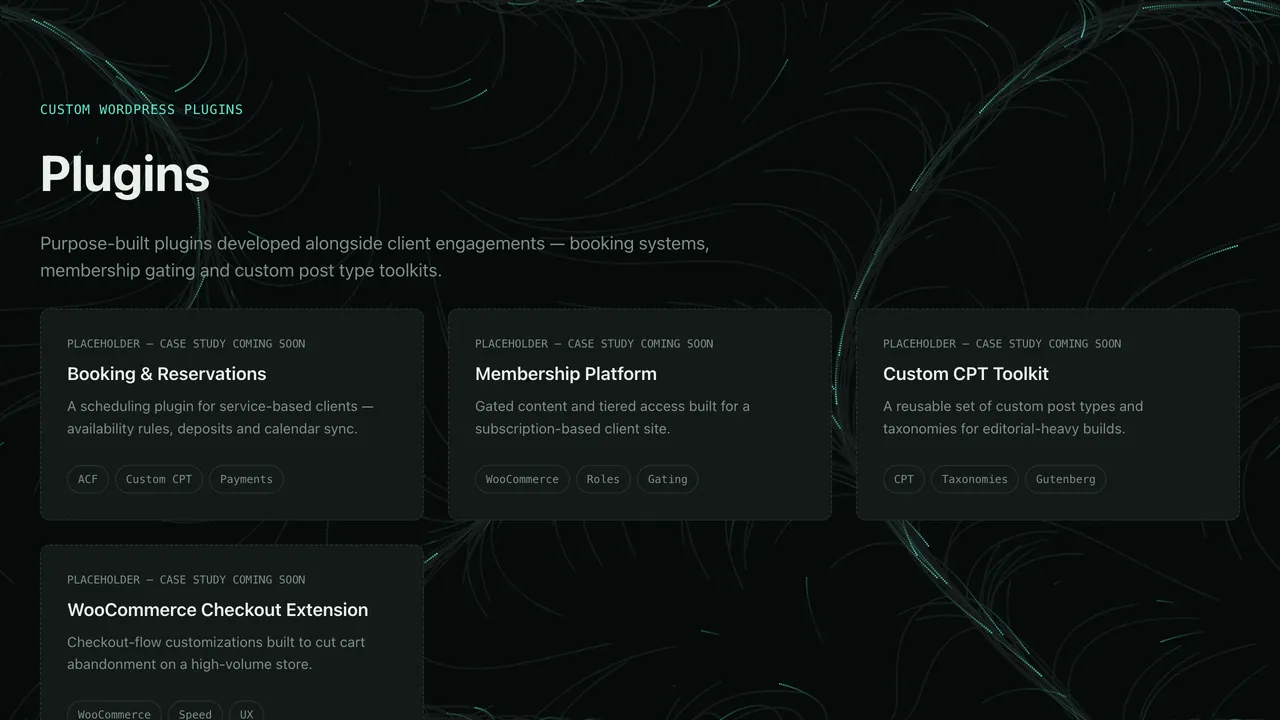
Grid of custom WordPress plugins with descriptions and tags.
 Grids & Listings
 GridVideoGallery
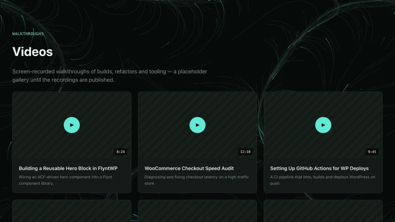
Responsive grid of videos from the Videos post type with lazy-loaded embeds.
 Grids & Listings
 GridComponentShowcase
This grid: filterable cards for every documented FlyntWP component, linking to live demos.
 Lists & Timelines
 ListWorkExperience
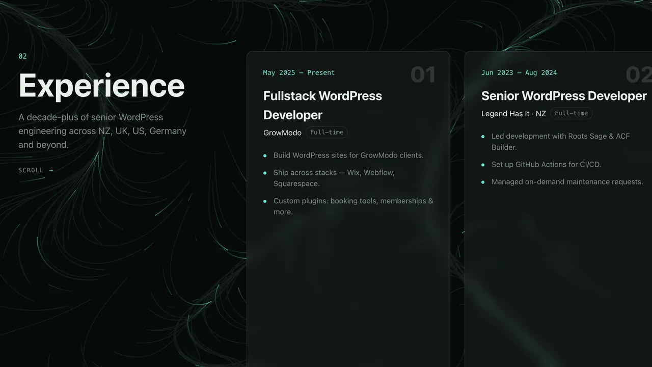
Pinned horizontal-scroll timeline of roles on desktop; a simple vertical list on mobile.
 Lists & Timelines
 ListCertificates
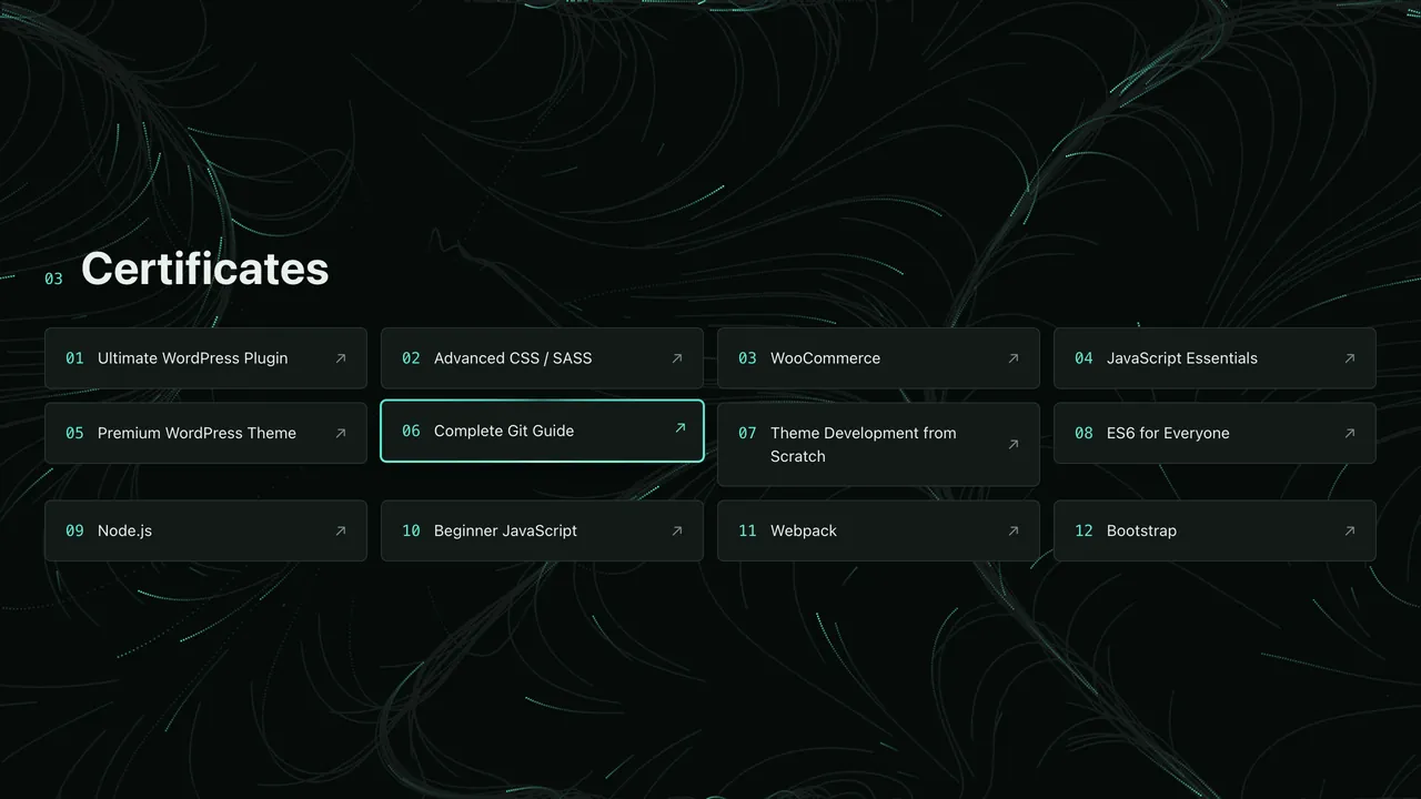
Numbered list of courses and certificates, each linking to its credential.
 Lists & Timelines
 ListContactLinks
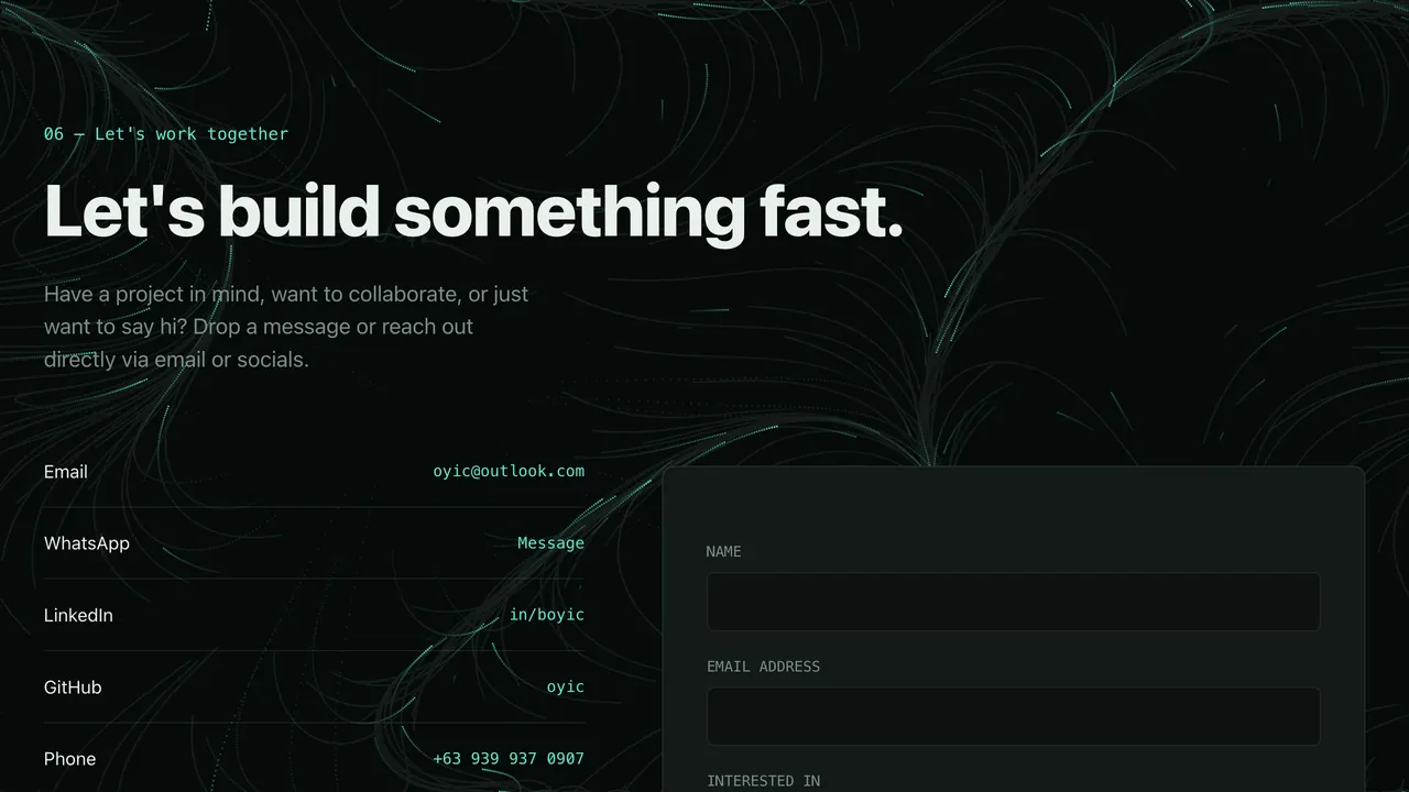
List of contact channels (email, LinkedIn, GitHub…) with label, value and link.
 Interactive Showcase
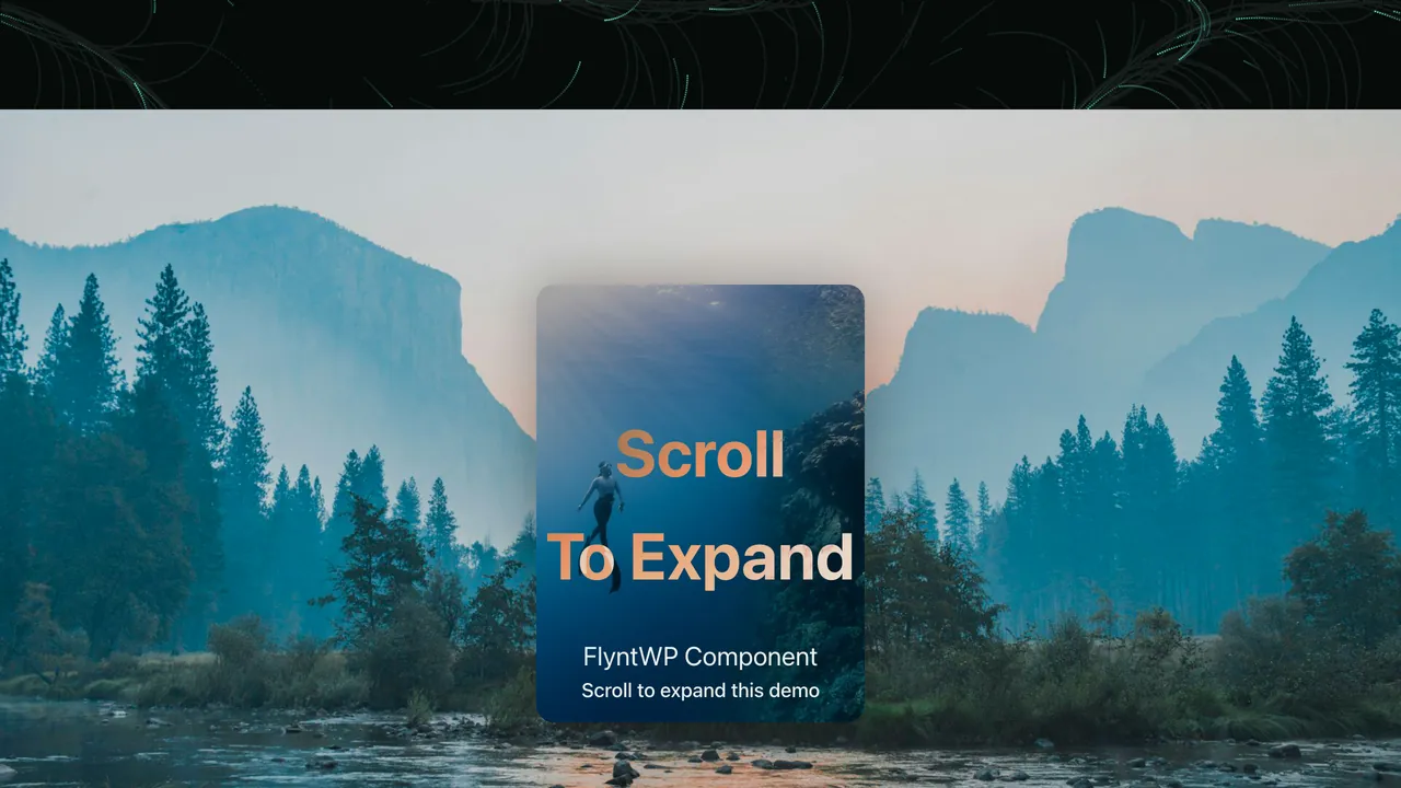
 ShowcaseScrollExpand
Hero media that grows from a small card to full screen as you scroll, then reveals body content.
 Backgrounds & Effects
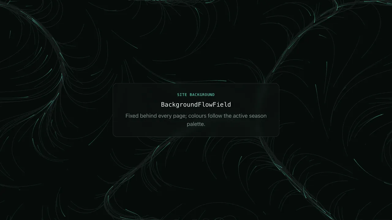
 BackgroundFlowField
Ambient particle flow field fixed behind the whole site, tinted by the season palette.
 Backgrounds & Effects
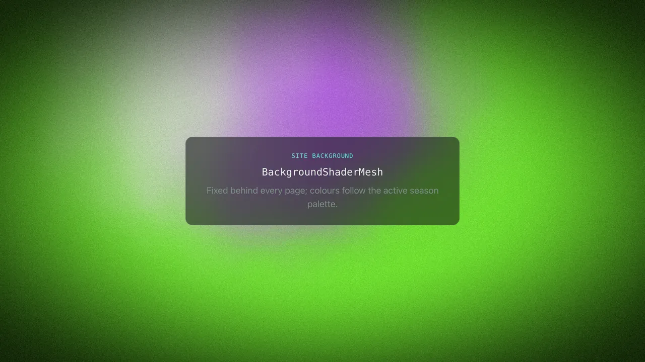
 BackgroundShaderMesh
Slow-moving WebGL gradient mesh behind the site, coloured from the season palette.
 Backgrounds & Effects
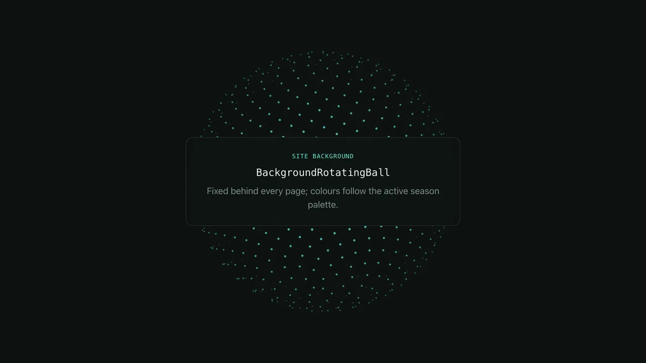
 BackgroundRotatingBall
Point-cloud sphere spinning behind the site, built from a Fibonacci sphere.
 Backgrounds & Effects
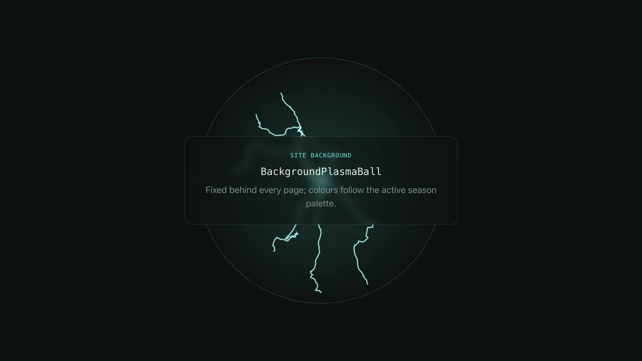
 BackgroundPlasmaBall
Plasma-globe effect with flickering electric filaments behind the site.
 Backgrounds & Effects
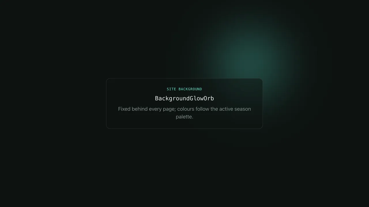
 BackgroundGlowOrb
A single soft light drifting on a random walk behind the site — never visibly repeating.
 Backgrounds & Effects
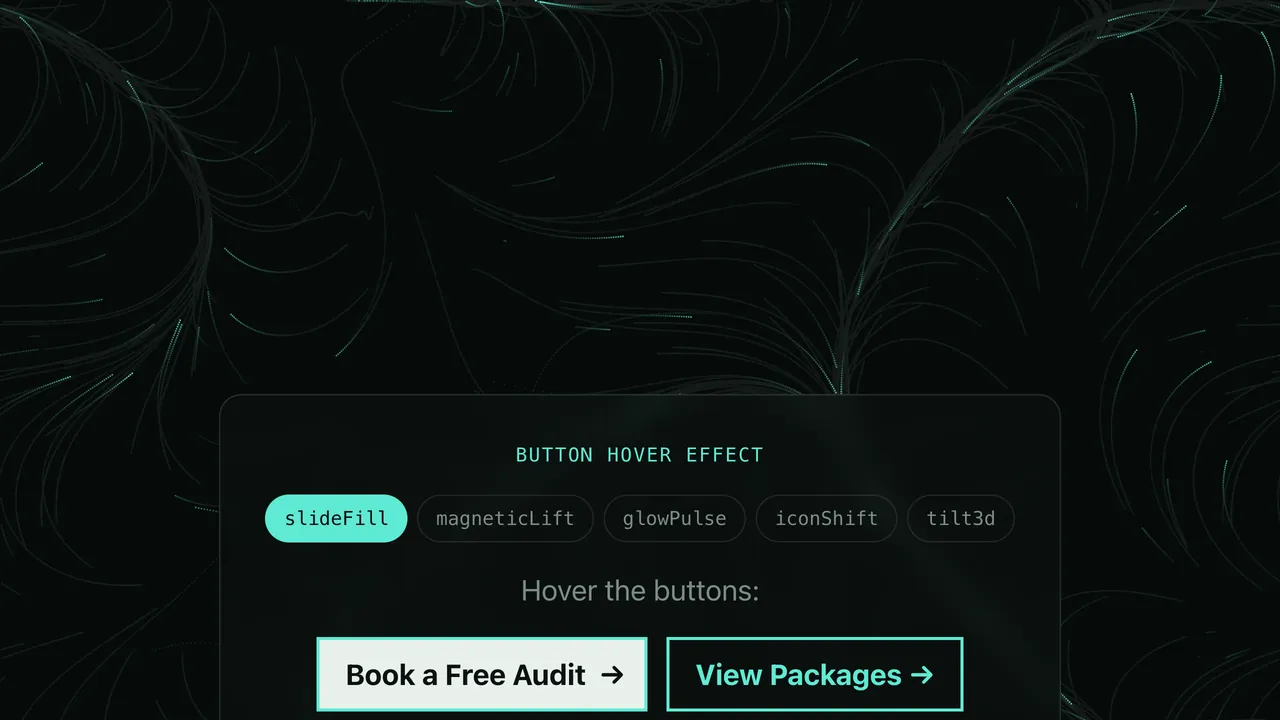
 GlobalButtonFx
Site-wide button hover effects: slide fill, magnetic lift, glow pulse, icon shift or 3D tilt.
 Forms & UI
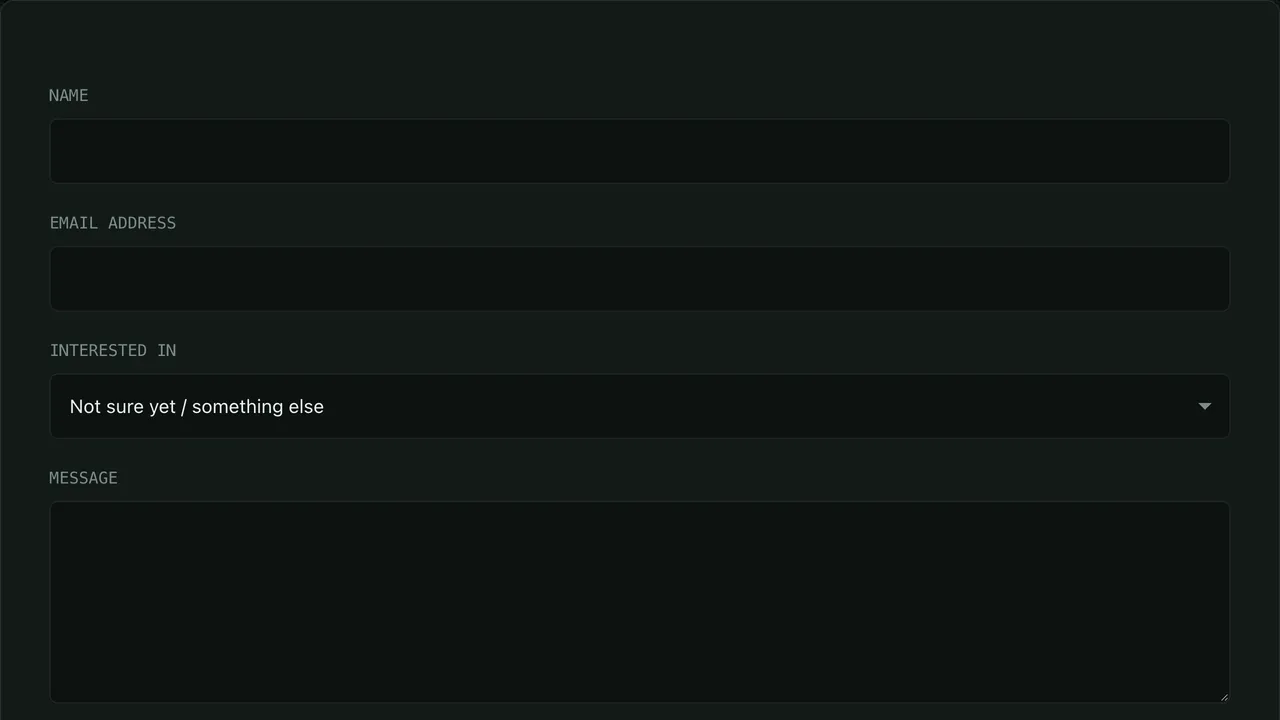
 FormContact
Accessible contact form with honeypot spam protection and a package dropdown prefilled from the URL.
 Forms & UI
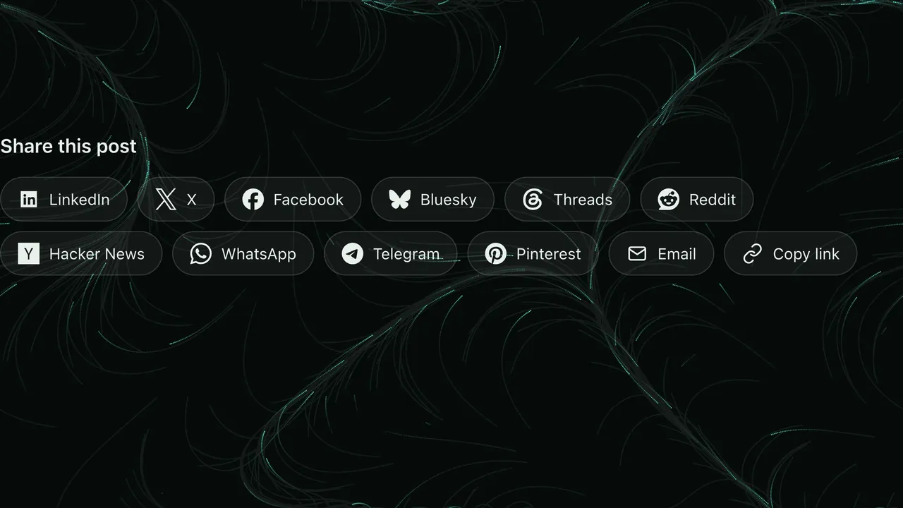
 ShareButtons
Privacy-friendly share links for 11 networks, copy-link and the native share sheet.
 Services
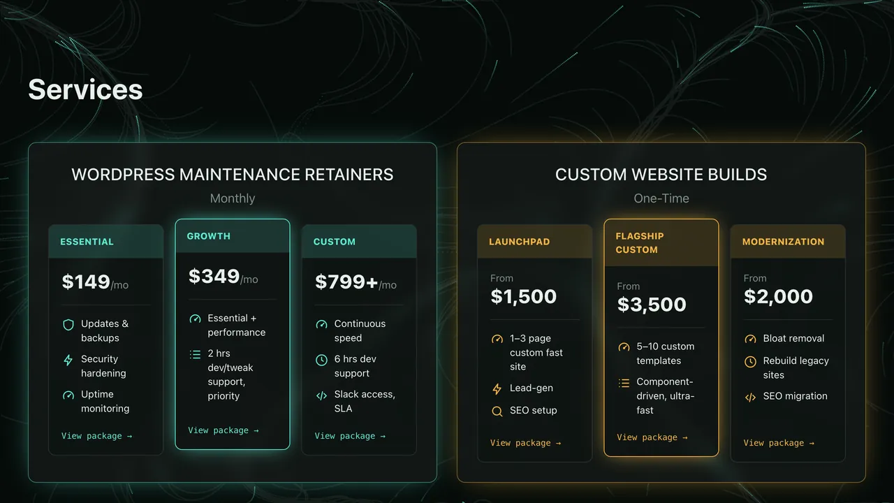
 GridServicePackages
Two-group pricing grid (retainers and builds) fed by the Services post type.
 Services
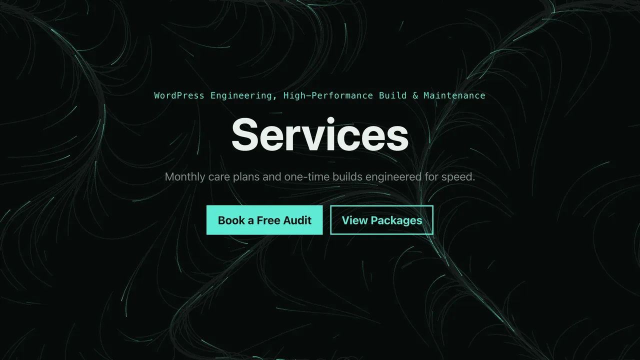
 BlockServicesHeader
Centered header for the services archive with eyebrow, heading, intro and two CTAs.
 Services
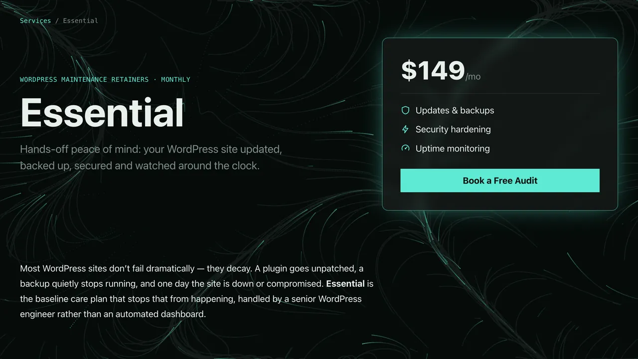
 BlockServiceLanding
Full landing page for one package: price card, inclusions, ideal-for, process, FAQ and structured data.
 Services
 BlockServiceCta
Closing call-to-action panel with heading and one or two buttons, coloured per service group.

FlyntWP Component
Scroll to expand this demo
Placeholder demo of the Showcase: Scroll-Expand Media component — scroll to grow the media to full-bleed, then reveal this text.
